Remote.app and Cover Art
I keep a mountain of content in iTunes and I am constantly accessing it one way or another. The iPad Remote application is one of the more common methods. It is a very well done application. Super easy, fast, polished.
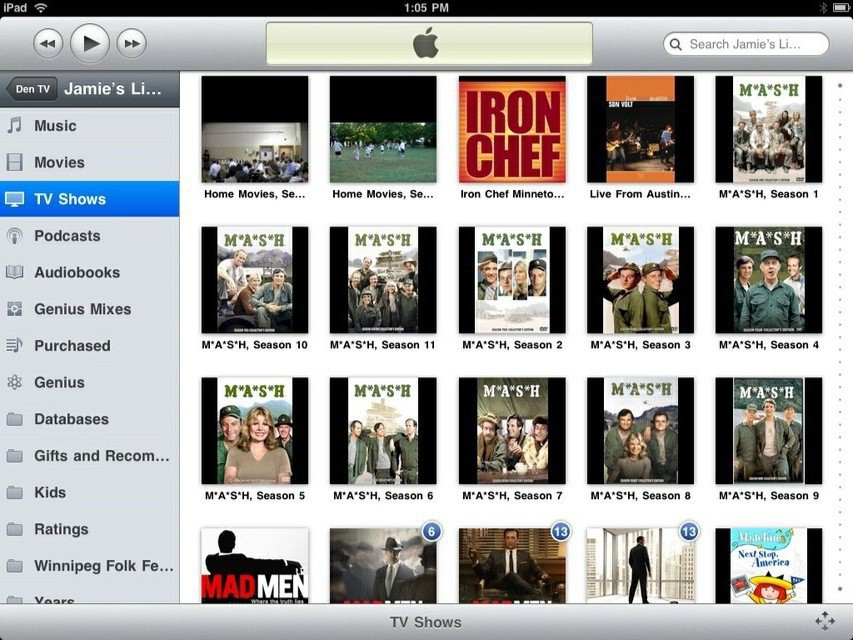
Except one thing. I have no idea why, but Remote insists on using a square black mask under cover art. Here is what it looks like.

Why oh why do this? iTunes itself just puts the images on white and it looks great. This looks like crap. Drives me bonkers. Apple, please change this! I have nearly broke down and changed all non-square cover art to square. However, then it looks weird on Apple TV. Why put any default color under it?
(Before you ask, yes, I own all episodes of M*A*S*H on DVD and ripped them all into iTunes.)